SimulIDE-R1657_Win32
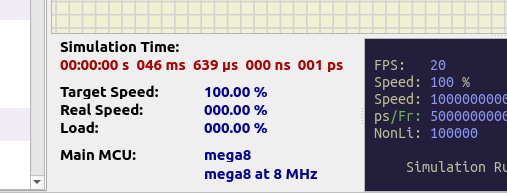
Speaking practically, I wonder if the 'Simulation Time' window (during debugging) could be moved to the right of the 'info circuit' window. During simulation (while debugging) the left side of the screen could be hidden under other windows, mainly by the MCU monitor that has many registers to watch.
In case this could be done, may I also suggest decreasing the width of the 'Simulation Time' window? Most of its surface is blanked. For example, the ns and ps timings could be displayed on a line below the sec, ms and us timings. By doing this, the window's data efficiency (data/surface) will be increased appreciably.
Anyway, I also understand in case my suggestion is not seen having a practical advantage during debugging or it is a bit hard to implement.
Kerim

 Latest images


