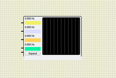
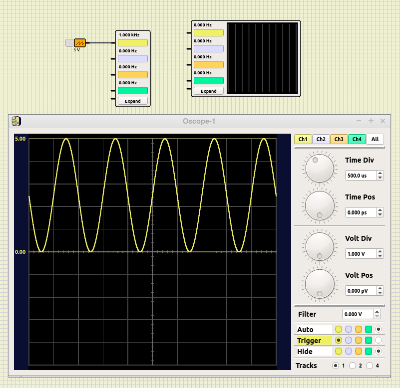
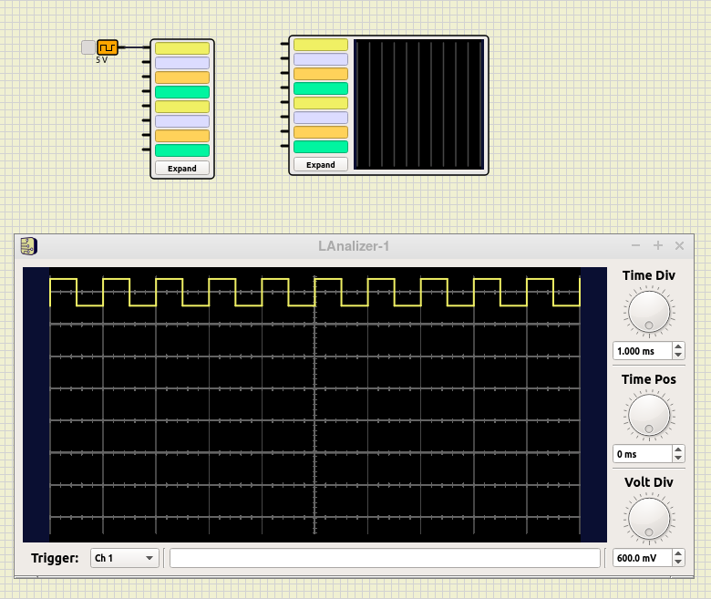
Bad bottom border of Oscope
3 posters
2 Re: Bad bottom border of Oscope Sat Apr 17, 2021 8:30 pm
arcachofo
That's weird...
Does Logic Analyzer looks the same?
What if you "expand" and close the oscope window again?
Does Logic Analyzer looks the same?
What if you "expand" and close the oscope window again?
3 Re: Bad bottom border of Oscope Sun Apr 18, 2021 7:51 am
vranik
The logic analyzer is displayed correctly.
It might be connected with the height of the component. There are two osciloscopes and two logic analyzers in attached picture. The first row has set Basic Y to 135 and the second row has set Basic Y to 150. It is strange for me that the osciloscope and logic analyzer with the same Basic Y value have different height. The width of osciloscopes and logic analyzers are the same.
If you sent me the file name and line number where the size is set I would try to find the problem.

4 Re: Bad bottom border of Oscope Sun Apr 18, 2021 9:36 pm
arcachofo
I think this is an issue about how simulide looks in diferent systems.
System theme overrides the original design, so adding an stylesheet for simulide is needed.
I haven't get into this, but there is a topic to talk about it:
https://simulide.forumotion.com/t49-appearance-in-diferent-systems
System theme overrides the original design, so adding an stylesheet for simulide is needed.
I haven't get into this, but there is a topic to talk about it:
https://simulide.forumotion.com/t49-appearance-in-diferent-systems
5 Re: Bad bottom border of Oscope Mon Apr 19, 2021 8:47 am
arcachofo
I added stylesheet to solve this issue.
It just sets font size and bold style.
But now, watching the pictures, I think font family is also changed.
This could cause problems as well, if so you can try to set it in the qss file:
It just sets font size and bold style.
But now, watching the pictures, I think font family is also changed.
This could cause problems as well, if so you can try to set it in the qss file:
- Code:
QLabel#freq0, QLabel#freq1, QLabel#freq2, QLabel#freq3{
    font: "Sans Serif" bold 9px;
}
6 Re: Bad bottom border of Oscope Sun Apr 25, 2021 2:21 pm
arcachofo
I could reproduce this issue in a VM with Ubuntu.
Tried to solve it with stylesheets but I could not find a way.
Looks like stylesheets only can modify some properties and it's not enought to solve some issues.
So the only solution I found is setting the style for the whole app to "Fusion".
This solves this issue and some other for me.
It is done in 0.0.15 brach Rev 165 and trunk Rev 256.
But there are still some problem it does not solve.
7 Re: Bad bottom border of Oscope Sun Apr 25, 2021 5:24 pm
Mistral
Sorry to occupy another topic but maybe it's usefull although it's a minor detail. Vranik has 0.4.15-SR1 and so do I but in mine (Win64) there are no colours in the text-fields.

And adjusting the settings comes with some preconditions, for example if the pV is entered with 2500 it does not catch. It has to be in steps of 1000 to go to the next level (=nV). This is not critcism, just an observation

And adjusting the settings comes with some preconditions, for example if the pV is entered with 2500 it does not catch. It has to be in steps of 1000 to go to the next level (=nV). This is not critcism, just an observation
8 Re: Bad bottom border of Oscope Sun Apr 25, 2021 7:56 pm
arcachofo
I will have a look.for example if the pV is entered with 2500 it does not catch.
9 Bad bottom border of Oscope Sun Oct 10, 2021 2:28 pm
vranik
Finally, I have found where the problem with the bad painting is. There is bad size of the widget at lines 170 and 171 in the file oscope.cpp. There is
The added constant should be 2*10. The value 2*4 is wrong.
- Code:
m_screenSizeX = m_baSizeX+2*4;
m_screenSizeY = m_baSizeY+2*4;
The added constant should be 2*10. The value 2*4 is wrong.
10 Re: Bad bottom border of Oscope Mon Oct 11, 2021 3:02 pm
arcachofo
Hi vranik.
Which version are you using?
Did you try last version?
I think this issue should be solved in last version.
Which version are you using?
Did you try last version?
I think this issue should be solved in last version.
11 Re: Bad bottom border of Oscope Mon Oct 11, 2021 6:27 pm
vranik
I am using 0.4.15-SR8. The problem is still present. Try to compare files logicanalizer.cpp and oscope.cpp. Why is there different constant in the same part of the source code? If I change it from 2*4 to 2*10 and recompile it the osciloscope is painted correctly.
12 Re: Bad bottom border of Oscope Mon Oct 11, 2021 11:29 pm
arcachofo
It would be nice to see how it looks in SR8 in your system and what is the diference.I am using 0.4.15-SR8. The problem is still present.
Then we could figure out what's the problem.
It should work with 2*4, indeed the wrong part is 2*10.Try to compare files logicanalizer.cpp and oscope.cpp. Why is there different constant in the same part of the source code?
Not exactly that is wrong, it is intended to fit the horizontal size, but then the vertical size does not match.
So it is not the correct solution.
This works in your current system, but might not work in other systems.If I change it from 2*4 to 2*10 and recompile it the osciloscope is painted correctly.
It does not solve the real problem, just gives more space so the widget does not overflow.
But the widget should not overflow with 2*4
The real problems I found are these:
1- Each system applies a diferent theme/style to the application, so widgets look diferent than the original idea.
This affects many other things: you can see in the pictures in Mistral's post, the appearance of the oscope expanded looks really bad, and the colors are also affected.
It should look like in this video in all systems: https://simulide.forumotion.com/t89-about-oscilloscope-0-5-15#808
2- Font sizes are diferent in each system, depending on screen resolution and configuration.
This makes the height of the frequency indicators is oscope biger or smaller in diferent systems.
Since SR2:
- By default "Fusion" style is applied, so all widgets should look the same in all systems.
- Font size in oscope frequency indicators is set to 9 pixels, so it should be the same height in all systems.
If these changes don't solve the issue in your system, then must be another problem or these solutions don't work as I think.
That's why it is important to see how the oscope looks with SR8 in your system.
13 Re: Bad bottom border of Oscope Sat Oct 16, 2021 1:46 pm
vranik
I attached the screenshot of sciloscope.

I did some comparison of osciloscope under Windows 10 and openSuse 15.2. I found out that I am not able to set the exact zoom to have pixel perfect comparison. Then I compared ratios only which is not exact.
Everything seems to be the same except the size of the button Expand and bottom border of the osciloscope.
In fact I don't know what the Basic X a Basic Y mean. I gess that it is size of the black area for waveforms. If I am right that it is strange that the Basic X a Basic Y values are the some for osciloscope and logic analyzer, but the area is bigger at logic analyzer. I expected that they should be also the same. They are not the same even under Windows 10.
I guess there must be some error in rounding of numbers
14 Re: Bad bottom border of Oscope Sat Oct 16, 2021 8:58 pm
arcachofo
Thanks.
It is better now, I see that the style has been correctly applied, but the font size remains the same.
This is how it should look like:

And this is a comparison, overlaping the 2 images:
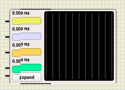
As you can see the font height is quite bigger in your system, adding pixels in each row.
The problem is not only that the widget gets out of the oscope box, the alignment with Pins is also affected. Pins should be aligned to the center of the corresponding box.
So this requires some way of hardcoding the font. Probably delivering the font with simulide will be the best aproach.
If you chane to 2*4 the the height and size of displays are the same, but the width of the widget is smaller in Logic Analizer.
And this is because the colored boxes in LA are smaller.
This is something unfinished, but my idea was that the stlyle + font fixed size solved the "bad looking" problem. So I went to more critical problems.
But I see this must be addressed and properly finished.
It is better now, I see that the style has been correctly applied, but the font size remains the same.
This is how it should look like:

And this is a comparison, overlaping the 2 images:

As you can see the font height is quite bigger in your system, adding pixels in each row.
The problem is not only that the widget gets out of the oscope box, the alignment with Pins is also affected. Pins should be aligned to the center of the corresponding box.
So this requires some way of hardcoding the font. Probably delivering the font with simulide will be the best aproach.
Yes, that's what it's intended to be.In fact I don't know what the Basic X a Basic Y mean. I gess that it is size of the black area for waveforms.
That's because the 2*10 used in Logic Analizer, used to match the widths of both components.If I am right that it is strange that the Basic X a Basic Y values are the some for osciloscope and logic analyzer, but the area is bigger at logic analyzer. I expected that they should be also the same. They are not the same even under Windows 10.
If you chane to 2*4 the the height and size of displays are the same, but the width of the widget is smaller in Logic Analizer.
And this is because the colored boxes in LA are smaller.
This is something unfinished, but my idea was that the stlyle + font fixed size solved the "bad looking" problem. So I went to more critical problems.
But I see this must be addressed and properly finished.
17 Re: Bad bottom border of Oscope Sun Oct 17, 2021 7:43 pm
arcachofo
Nice to know it is working now.. that's a relief.
Thanks to you for following on this issue, if not, it would be unsolved.
Thanks to you for following on this issue, if not, it would be unsolved.
Permissions in this forum:
You cannot reply to topics in this forum

 Latest images
